4 assesment dRawing week 1

I drew my shoe in this drawing. My main problem when I was drawing this is shading.
|

I drew a street view in this picture. My main problem when I was drawing this is adding details.
|

I drew a self-portrait in this drawing. My main problem when I was drawing this is the face features.
|

I drew my hand in this drawing. My main problem when I was drawing this is adding values.
|
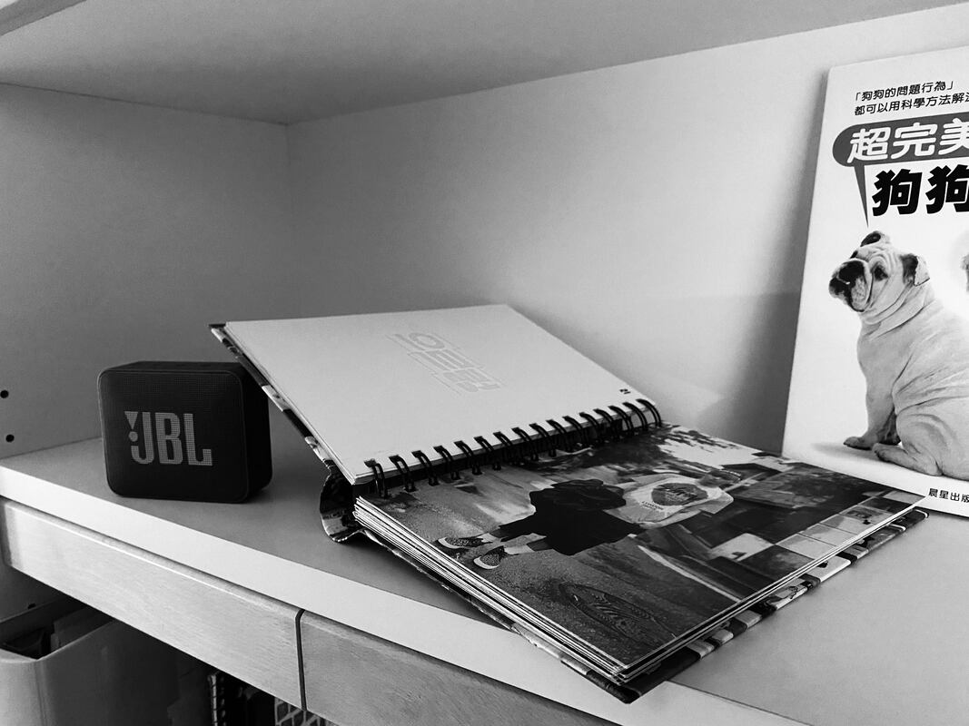
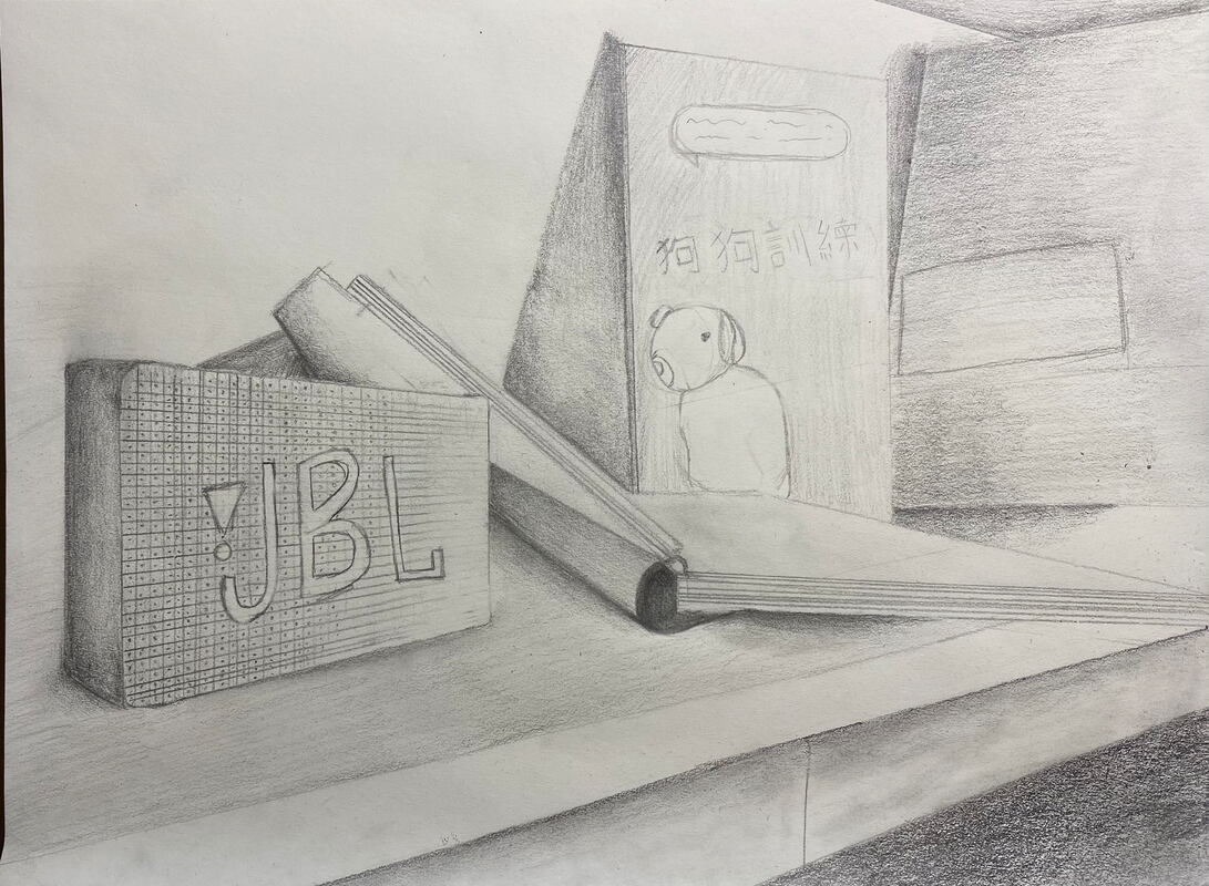
I drew one of my shoes, my self portrait, one point perspective street view and my hand.
Photography week 2

|

|

|


|


|


|
I took 9 pictures at different angles for this project. I decided to use my perfume as the object because I think it looks pretty. I think this is a really fun project because I realized that there is a lot of angles to draw.
Shading


I drew a sphere, cube cylinder and a cone for this assessment. I think my sphere looks good but I should be careful with the pressure because some of the shadings look weird.
Unseen things
Brainstorming ideas
- Bookshelf with 2-3 books open and some on the side.
- Drawers with utensils and kitchenware in it.
- Standing next to my bed
- Inside a lamp
- Inside a vase
- Jewelry box with rings, bracelets, and necklace in it.
- Pen holder next to the window and with a few pens in there.
- Faucet on and washing a fruit.
- Fireplace on and with some family photos.
- Door knob
Reference Photo

|
|

3 Sketches

|

3 in progress pictures
|

|

|


|
Final Drawing
I started by drawing some light sketches on the objects, then I went it and kind of trace the line that I want. After that I erase the sketch lines that I don't want and started adding shadings. Compositions is really important because it makes the main objects stand out and it makes the drawing looks neater and clearer. I found the different values in my picture my adding a black and white filter to my picture so I could see the different values clearer. I achieved full range of the different values because there are some really dark and some really light shadings in my drawing. I think I could've made this neater by being more careful with the sketch before shading. It is very important to learn the skills before we start the final drawing because we can understand and use those skills when we draw. An obstacle I overcame was adding the details in my drawing.
Pen and Ink
Value Chart
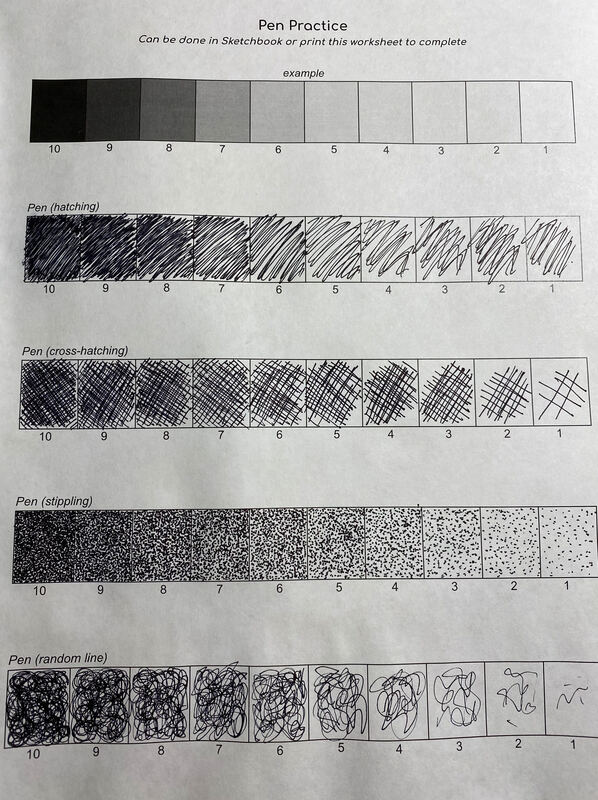
We did a practice on how to create values with a sharpie pen. I learned that if you make more lines/crosses with the sharpie pen the darker the value is.
Stippling
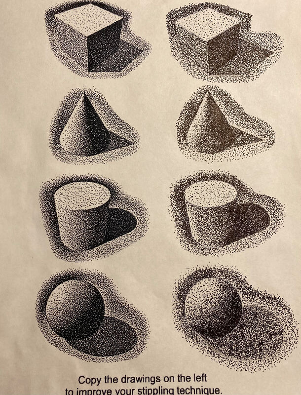
I really like this assignment. I think it was fun but it also took a lot of time and effort to make sure the values are different so it would look more 3D.
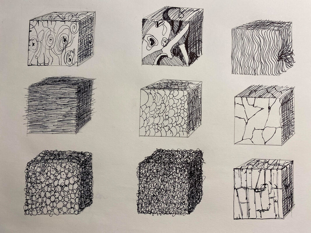
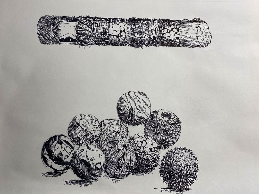
Texture Drawings
|
|
I think this assignment was the hardest one out of these three because you really need to focus on how to make them looks realistic and you need to make sure you have the same light source for all of the shapes.
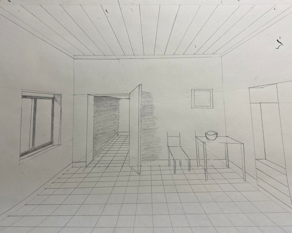
Perspective

|

|

|
I took 3 forced perspective pictures. The first one is my dog being almost crushed my a slipper. The second one is my dog wearing a hat. The third one is an apple that is on his nose.
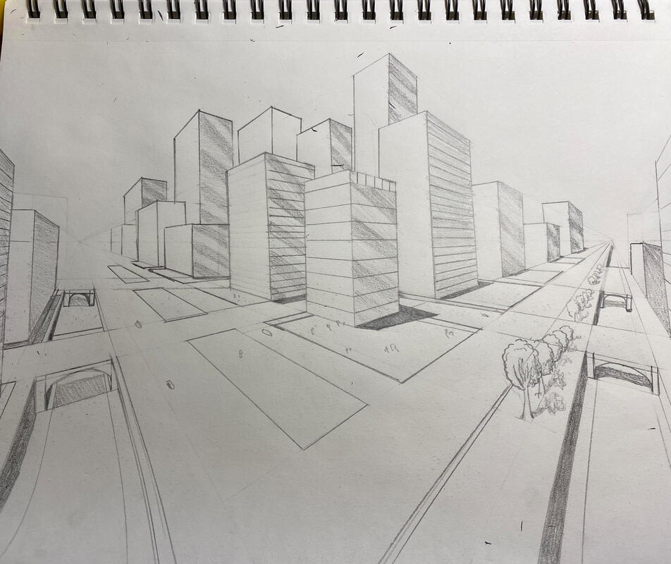
point perspectives
1 point
|

|
2 point
|

|
3 point
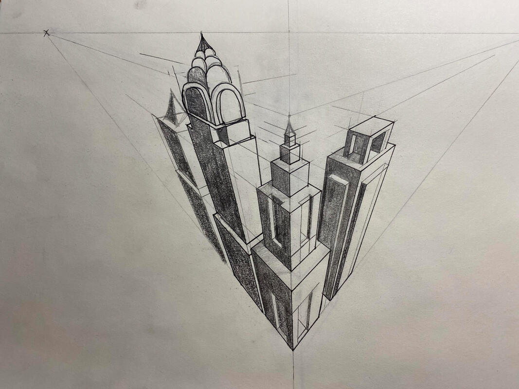
|

|
We learned how to draw buildings for 1 , 2, and 3 point perspective. We also learned bird and worm eye view. I think this assignment is fun because we get to see things through different angle and view.
Pen Perspective
Brainstorming Ideas
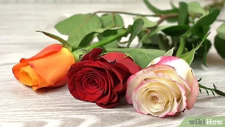
- Belle and the Beast with rose petals around them in the container where the beast keeps the rose.
- Ariel singing while her voice turns into little memory bubbles.
- A huge apple with worms coming out and Snow White in the middle .
- A lot of lanterns and a huge magic flower in the middle biggest lantern from Tangled
- Pinocchio in half wood and half human inside a cage.
- Red Riding hood with a wolf cape and hiding inside a group of wolfs.
- Jack grabbing a branch that is coming out of the beanstalk as he climbs it.
- Old Cinderella trying on the glass slipper.
- Alice wearing a hat the Mad Hatter made.
- Mad Hatter stuck in a huge tea cup.
- Red Riding hood with her grandma in her house in a snow globe.
- Three little pigs building their brick house while the wolf stalks at them behind a tree.
- Sleeping Beauty reaching to the needle while the little animals are trying to stop her
- Tiana in the frog form and the frog dancing with fireflies next to them.
- Zoomed in on Ursula’s eyes and Ariel inside them crying.
- Ariel looking up to the land in worms eye view
- Jack looking down at the city in bird eye view
- Ariel transforming to human
- Belle dancing with the beast in the ballroom while Gaston looks at the through the window. \
- Snow White eating the poison apple.
Reference pictures/ Sketches

|

|

|
|

|

|

|

|
In Progress drawings

|

|

|
Final Drawing
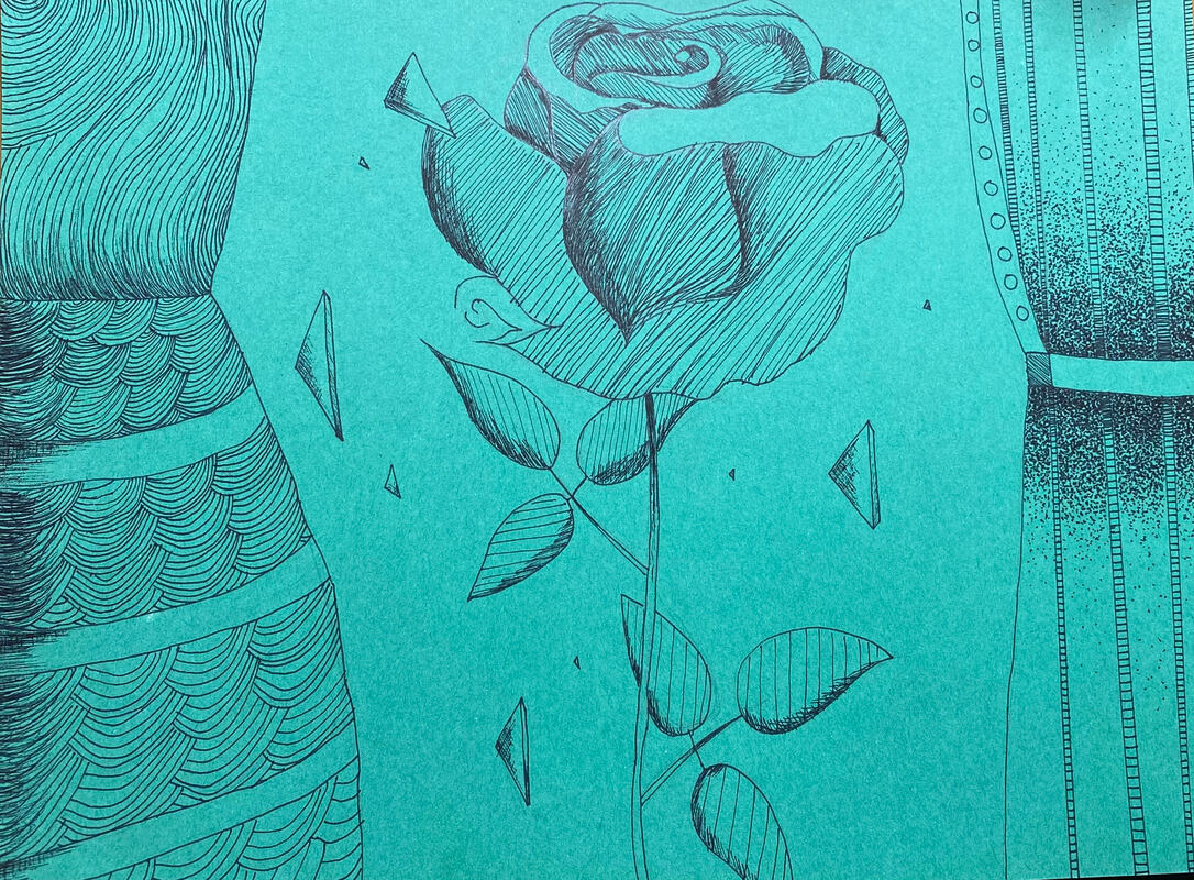
I chose to use hatching for my rose because I tried multiple techniques but it turns out the best with hatching. I chose to do patterns for Belle's dress because I think it looks better with patterns then cross-hatching when I was practicing this on another sheet of paper. I did stippling for the beast's suit because I wanna do a different technique and stippling was the first thing that came up to my mind. I focused on the rose because I think rose is one of the main object in Beauty and the Beast. Texture is important because it makes your drawings realistic, Value is important because it creates shading which makes the objects look 3-dimensional. I think I did really well with this drawing. If I could recreate this project I would probably shade the rose neater. I did Beauty and the Beast and I represent this story in my way by focusing on the rose rather than the 2 main characters. It is important that you understand the concept because you might use a wrong technique when you are adding texture or shading your drawing. I thought we could only use hatching, or other techniques to add values but now I learned that we can use patterns to add values!
Colored Pencil/ Watercolor
Colored Pencil Froms

|

|

|
I think I did better with the spheres. The cones are harder than I thought it would be but I really like this assignment because we get to practice our techniques.
Colored Pencil Fruit and Veggie

I think I did well with this assignment but I could have work and add more layers to the tomato to make it looks more realistic.
WaterColor Techniques

I think this assignment was pretty fun because we get to practice and see the different watercolor techiniques.
Watercolor Value Chart and Forms

I think I did well with this assignment because I think the values look great!
Watercolor Peppers

Georgia O'Keeffe Inspired Painting
Brainstorming Ideas
- Close up to the flower
- Close up to a nose of a dog
- Close up to a butterfly wing
- Close up to bubbles with light reflection
- Close up to tiger’s fur
- Close up to a peacock’s tail
- Close up to a watermelon
- Close up to a milky way
- Close up to a jellyfish
- Close up to a fabric with patterns
- Close up to a painting
- Close up to a banana
- Close up to a seashell
- Close up to a colorful braid
- Close up to Snake
Compositional Sketch/ Reference Photos


In Progress Pictures

|

|

|
Final Drawing

I created values to my bubbles by adding more layers and using a white colored pencil to add the highlights. I added a lot of layers because you can make a lot of mistakes if you just color a really heavy layer to your drawing; it would also be hard for different colors to blend. It is important to add a transport layer to your drawing because you can see if that's the right color you want. I think I did ok with the composition. I could have draw the top 2 circles closer to the middle one so the space wouldn't look so empty. I also could have draw the middle bubble bigger than the other ones. I think color choice is really important because it is one of the factor that shows whether your drawing is realistic or not. If I were an art critic I would say I did a good job but I could have done more. If I was able to change something about this drawing, I would definitely do what I said, which are move the top 2 bubbles down and draw the middle one larger. I learned that you should always start with a really light layer so that you won't make any mistakes and the colors will blend will.
Collage
Brainstorming Ideas
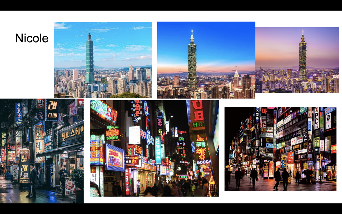
- Itaewon,Seoul South Korea
- Taipei 101, Taiwan
- Neuschwanstein castle, Germany
- Eiffel Tower, Paris
- Tokyo Tower, Tokyo
- Phuket, Thailand
- Great Wall, China
Reference photos
In Progress Pictures

|

|
Final Collage
|
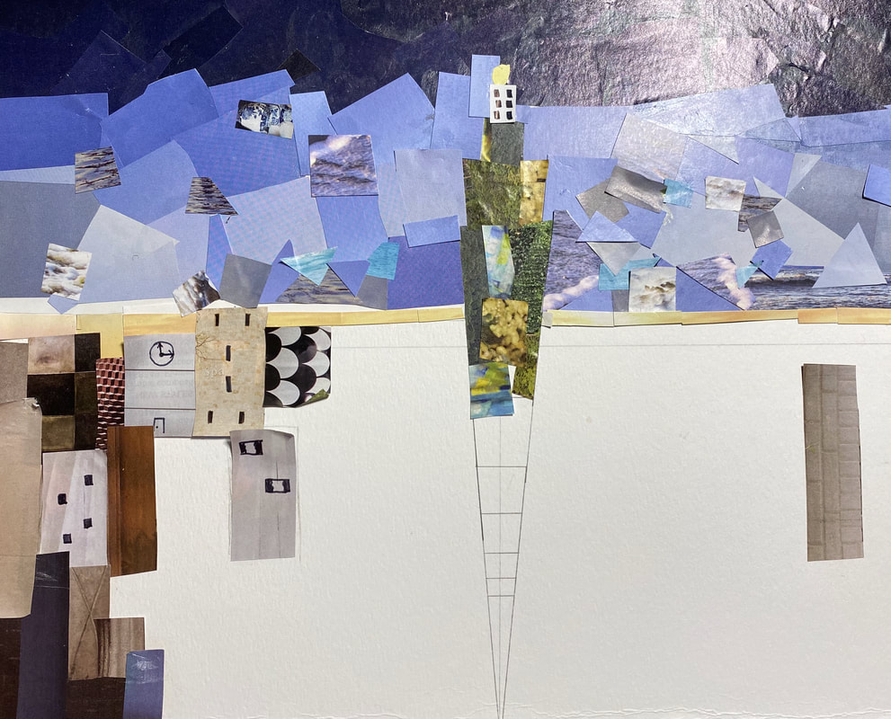
One of the reasons I chose Taipei 101 is because I'm from Taiwan. Another reason is because I thought it was very cool how it has 101 floors. I would say my accuracy of proportion is very inaccurate because it was hard to find all the colors I needed and the hardest part was the buildings. It was very difficult to find buildings that match the actual picture because in Taiwan most people don't live in houses like Americans; we usually live in apartments. So, that was a really challenging part( To be honest, I don't think my buildings look like buildings). For the sky, I added a few blue pieces to make it looks more unique because I thought it looked too ordinary if I just did it all in blue. I added some pieces of sea to make the sky more lively. I also used grasses and plants for my Taipei 101 because it's green and I thought it would be cool if I used plants to make it pop out. I did big pieces because I thought it looked cleaner and then I went back and added little pieces to add texture. I think I did terrible with recreating the picture but I tried my best. It was very hard to find the buildings so I used different texture and patterns to create buildings. I made the top of the sky darker because that was how it looked like in the original picture and I thought it would add value to my collage. I think it looks somewhere in between neat and messy to me because I think the large pieces of sky are really neat but I went back and added more things which kind of made the sky a little messy. If I can redo this project, I would definitely change my reference picture; I would change it so something a little bit easier.
|

|
